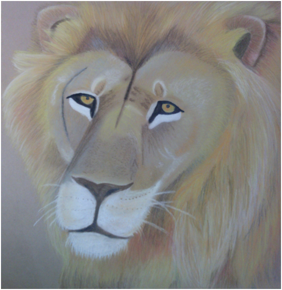
For the up close and personal project I decided to draw a lion with chalk pastel and some pencil. For the lion's face and the hair I used chalk pastel. For the eyes I used pencil, I just thought the eyes had to be more detailed and with the chalk pastel the eyes would have come out too messy, in my opinion. The more I worked with the chalk pastel the more I began to like it. I think it's such a nice way to blend the colors and and to layer the colors on top of each other. On the face I did more of blending with the chalk pastels and later on decided to add some of the texture that is the fur. On the mane, I didn't blend the colors as much because I thought the lines would give it more texture. I learned how to blend the different colors of chalk pastels and improved the skill even more. It was difficult to layer the colors because they usually didn't layer as I intended them to, but in the end they all worked nicely together. Before starting this project I was a bit hesitant. I thought it would be too complicated to draw the lion and incorporate the many textures, but I decided on the lion despite that because I had always wanted to draw a lion. Once I started the project and started drawing the mane I stepped back and really liked how it was turning out. I didn't know I was capable of adding the texture and the many colors but in the end I really liked it. Before I started I already had in mind that I would blend the colors in the face and the colors in the hair. As I started drawing it I decided that the blending didn't show much on the brown paper so decided to make the colors bold so they would stand out. I used different colors that don't usually stand out on a lion's mane because I thought it would make it stand out. I used pinks, bright orange, and neon yellow to make the mane bright and shiny. Throughout my whole work I asked students from my table what colors would look better and the different techniques. This really helped me because it opened my mind to different techniques and different ways my lion could look good. I learned important skills on the way to handle chalk pastels from the students surrounding me. Either in the blending or the way to go about layering the colors. In the end, I was very proud of my project and surprised on what I could accomplish with my skill.
Thursday, March 27, 2014
Tuesday, March 11, 2014
Scientific
At the beginning of this project I had begun working on some ideas such as leaves and trees but in the end I decided to go with a lava lamp because I thought it would be something different and it would clearly depict the theme of scientific because of the use of electricity and light. While in class we worked with many types of mediums such as pencil, pen, and charcoal. I thought the mini lessons were very helpful in the development of this project because it helped me understand the importance of contrast and value. The mini lessons also helped me exercise my skill specially when working with the spheres and bottles. Contrast, I think, is a vital part of a work of art to make it appear more realistically. I used contrast by making the checkerboard tile very dark and making the rest like the lava lamp and the background much lighter. I decided to work with pencil on this project because for me it was the easiest and the one I had more experience with. I also enjoy working with pencil and it let me more room for mistakes than the pen and the charcoal. Plus, I think that charcoal is very messy and hard to work with. All throughout my artwork I used lines, these helped me get the contour of the lava lamp and also the shape of the bubbles in the lava lamp. With this project I didn't have much risks. Firstly, I was working with pencil which gave me the chance to erase any mistakes and create either darker or lighter values much easier. I tried to create the lava lamp as symmetrical as possible and also the checkerboards. The only risk, in the beginning, was leaving the page too blank. In the beginning I was only planning on drawing the lava lamp but it definitely looked empty, so in the very end I thought of adding the checkerboard which was a great idea because not only did it fill some of the blank space, but it also draws the a person's focus to the lamp. Overall I really enjoyed this project and was very satisfied with the end result. I enjoyed working with pencil and gladly I had an eraser because at times it would smear. In the end the positives outweighed the negatives and it ended up being a decent piece of artwork. I was honestly surprised at how well it turned out, well that being my opinion.
Subscribe to:
Comments (Atom)

